

Introduction
The Bitcoin Rainbow Chart is a widely-used tool for long-term trend analysis in the cryptocurrency market. It overlays a logarithmic regression curve on Bitcoin’s historical price data and segments this into rainbow-colored bands, each corresponding to different market sentiment zones, ranging from “fire sale” to “maximum bubble.” Originally designed to provide an accessible visual representation, the Rainbow Chart helps investors understand where Bitcoin’s price currently stands in relation to its past cycles. For example, when Bitcoin’s price dips into the lower blue bands, it suggests a deep discount; conversely, when it rises into the red bands, it indicates an overheated market.
It's important to note that the Rainbow Chart serves as a guide rather than an exact predictor of price movements. By smoothing out volatility and highlighting long-term trends, it does not forecast short-term price swings. According to Cointelegraph, it provides a “broad perspective” based on historical data instead of precise predictions. In other words, while it can suggest potential future price movements based on historical patterns and market psychology, it should always be used in conjunction with other analytical tools and risk management strategies.
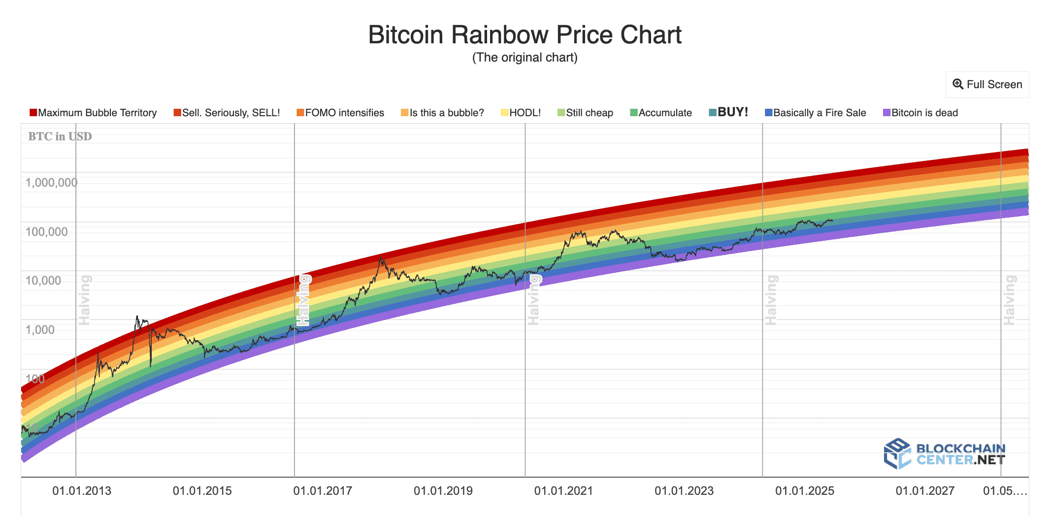
Original Bitcoin Rainbow Chart (source)
What Is the Bitcoin Rainbow Chart?
At its core, the Rainbow Chart is a long-term valuation model for Bitcoin. It was first created by a Bitcointalk user named “Trolololo” in 2014 to illustrate Bitcoin’s exponential growth through a logarithmic regression. The initial version was a simple curved line, but later in 2014, a Reddit user named Azop added colorful bands and playful labels, which helped to popularize the chart in the crypto community and transformed it from a mathematical representation into a more engaging narrative tool.
Technically, the chart’s formula is based on a logarithmic regression fit to Bitcoin’s price history (for example, one version is y = 2.9065 ln(x) - 19.493). This formula generates a smooth curve on a logarithmic price chart, with fixed-width bands drawn around it in ascending colors: dark blue at the bottom, transitioning through green, yellow, orange, and red at the top. These bands represent different value zones:
-
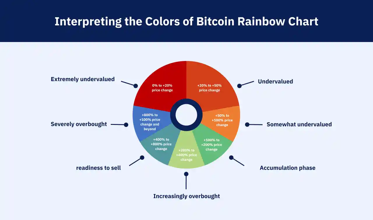
Bottom bands (blue/indigo): Labeled “fire sale” or “accumulate,” indicating extreme undervaluation.
-
Middle bands (green/yellow): Labeled “still cheap” and “HODL,” suggesting fair or moderately above-fair value.
-
Top bands (orange/red): Labeled with warnings like “bubble?” and “sell,” indicating overvaluation and euphoric extremes.
In practical terms, the Rainbow Chart allows users to visualize Bitcoin’s price history along with investor sentiment. It becomes easy to identify when Bitcoin prices fall into “buy” zones versus “sell” zones. By emphasizing investor psychology rather than raw price alone, this chart is especially helpful for long-term crypto investors seeking an intuitive gauge of historical valuation trends.
Psychology Behind Bitcoin Rainbow Chart
The colored bands of the Rainbow Chart symbolize the collective mood of the market, with each band reflecting a different level of investor sentiment. When Bitcoin's price is within the blue/green bands, the market is typically fearful or cautious. This often occurs after a crash or during a bear market, where investors might quip, “Bitcoin is dead!” Meanwhile, the chart humorously suggests a “fire sale” (deep blue). Historically, these blue bands have presented excellent buying opportunities as market conditions eventually improved.
As the price climbs into the middle bands (green-yellow), investor sentiment shifts from fear to optimism and confidence, leading traders to believe that "the bull is back," prompting them to hold their positions. When Bitcoin's price reaches the orange/red bands, greed and euphoria take over, with media hype and fear of missing out (FOMO) peaking in these areas. The chart humorously warns, “sell, seriously, SELL!” or indicates “maximum bubble territory.”
Recognizing this psychology can be valuable for traders using the chart as a reality check. For instance, if Bitcoin is in the red band and trending upward, it likely implies that most traders are excessively optimistic; thus, locking in profits may be wise. Conversely, if prices are in the blue band, it indicates high fear and many traders giving up, presenting opportunities for contrarian investors to accumulate. In summary, the Rainbow Chart simplifies complex market sentiment into a straightforward color signal: blue indicates a value zone, while red signals a caution zone.
How to Identify It
You can view the Rainbow Chart on various charting sites or cryptocurrency resources. The original interactive Rainbow Chart is hosted on BlockchainCenter.net. Many traders simply consult these sites, which overlay the Rainbow bands on Bitcoin’s live price. If you’re using Phemex or another exchange that doesn't have a built-in Rainbow tool, you can mimic it by observing the price relative to its long-term log curve or by referring to images of the chart.
For an on-chart tool, there are Bitcoin Rainbow Chart indicators available on TradingView and other platforms. To use it, select the indicator called “Bitcoin Rainbow Chart” (or something similar) from the public library. Once applied, you can identify where the current price falls among the colors. Are we at the bottom of blue, the middle of green, or the top of orange? That’s all the information you need.
Another way to identify the band is by price level. For instance, if Bitcoin is at $50,000 in 2025, you can estimate where that would fall on the Rainbow. If $50k is in the green band, the chart indicates fair value; if it reaches $70k and crosses into the orange or red zones, it suggests overvaluation. Essentially, you don’t need fancy tools—just note which color zone the price is in. This indicates whether the market is in fear (blue), neutrality (green/yellow), or greed (orange/red).
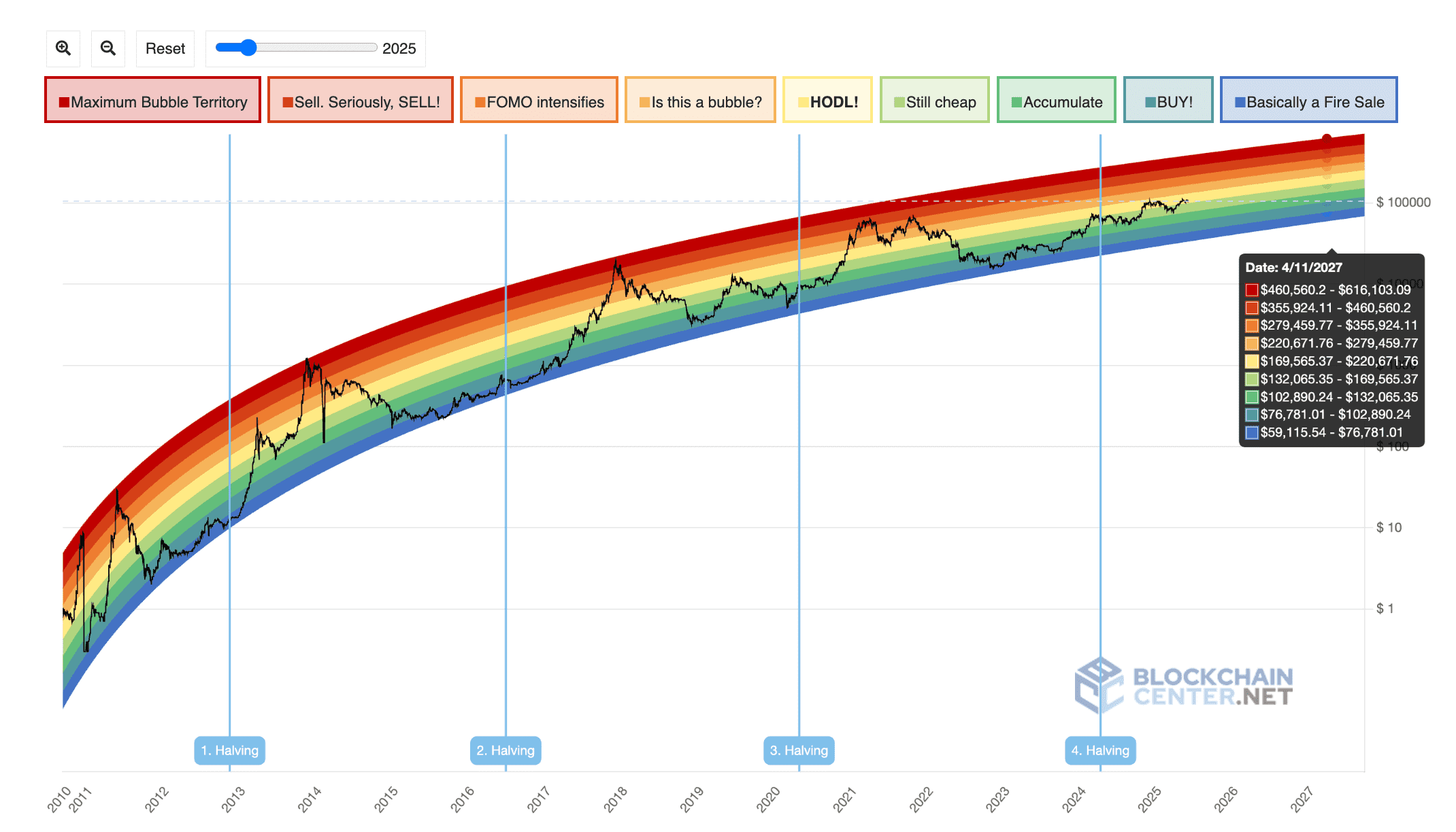
New Bitcoin Rainbow Chart updated in 2023 (source)
How to Trade the Bitcoin Rainbow Chart
Trading with the Rainbow Chart focuses on strategy and sentiment rather than short-term precision. Traders typically use the chart as a valuation guide. Common strategies include:
-
Buy in Blue/Green Bands: If Bitcoin’s price falls into the lowest bands (blue/indigo), consider adding to your position. Historically, these zones were seen as undervalued "fire sales." For example, if the price dips back down to the green or blue zone, some traders set limit orders to accumulate.
-
Hold Through Middle Bands: When the price is in the green/yellow zones, sentiment is moderate. A common tactic is to hold existing positions or dollar-cost average without making drastic moves. These zones generally suggest that there’s no immediate buy or sell signal - just stay invested.
-
Sell/Reduce in Orange/Red Bands: In the upper bands, start taking profits. During euphoric rallies (orange/red zones), traders often sell in tranches. One approach is to set sell orders incrementally as the price advances through orange and red, rather than waiting to reach the absolute top. This strategy helps lock in gains instead of hoping for the highest price.
-
Confirmation with Indicators: Always combine the Rainbow signal with other tools. For instance, if Bitcoin is in the red band, and the RSI indicator is also overbought or the Fear & Greed Index indicates extreme greed, it strengthens the case to sell. Conversely, a blue band entry is more convincing if momentum indicators show signs of a bullish reversal. The Rainbow chart provides context, but a second indicator can validate your moves.
In practice, the Rainbow Chart is often used for swing or position trades over weeks or months. Some traders “buy the dip” when the price is in blue and later sell when it reaches the red zones. For example, savvy investors bought heavily in 2020 when Bitcoin was in the blue band and later cashed out in 2021 as the price entered the red zones. Remember, this is not a day-trading tool; plan for longer time frames.
A rule of thumb is to treat the bottom of the blue band as strong support and the top of the red band as strong resistance. You can set alerts on Phemex for those price levels. Always apply prudent risk management. Use the Rainbow Chart as a guide, not an absolute rule; it indicates “this zone has historically meant X,” but the market can defy expectations at times.
When Not to Use It / Limitations
While the Rainbow Chart is a useful tool, it has clear limitations. First, it’s not intended for short-term timing. It is based solely on Bitcoin’s historical price, meaning it doesn’t account for news, regulations, or sudden events. Avoid using this chart for hourly trading; it is designed for a multi-year perspective.
Second, it presumes that Bitcoin will continue on its historical growth path. If a paradigm shift occurs (e.g., a major regulatory crackdown), the chart’s model may fail. After the 2022 crash briefly pushed Bitcoin below the lowest band, the chart was recalibrated in late 2022. This indicates that the bands need updating as markets evolve, so always check that you’re looking at the latest version of the chart.
Third, be cautious of psychological pitfalls. For instance, Bitcoin might remain in the green band for months without a rally, leading to frustration for holders who expected a bounce. Conversely, during a raging bull market, the price might surpass the red band without an immediate pullback. In short, the bands can lag behind real sentiment. It is essential to combine Rainbow signals with other analyses. If the price enters the blue band but the overall market is declining, consider waiting for better confirmation. Similarly, if the price is in the red band but the fundamentals are strong, it might not be the best time to sell.
Lastly, remember any pattern can fail. The Rainbow Chart is best used as part of a broader strategy. Use it to gain perspective, but always do your own research (on-chain stats, news, etc.) before trading.
Bitcoin Rainbow Chart Colors (source)
Bonus Tips or Historical Notes
Origins: The Rainbow Chart has an interesting history. It originated as a meme model created by user Trolololo in 2014 and gained its colorful appearance thanks to Reddit’s Azop. It went viral within the crypto community, especially during the 2017 crash, when a famous tweet highlighted investors rejoicing in the "buy" zone, which later proved to be prescient.
Evolution: The chart continues to be updated. In November 2022, its creator released a new version to reflect a decade of data. Cointelegraph reported that it was updated again in 2023 to incorporate the latest price dynamics. Always ensure you refer to the current chart.
Other Coins: Inspired by Bitcoin’s rainbow, some traders have created Rainbow Charts for other assets, such as Ethereum. The concept is similar: a long-term logarithmic curve with colored bands. However, Bitcoin’s Rainbow Chart is the only one with a proven track record and substantial community following.
Cultural Impact: The Rainbow Chart’s success is partly due to its status as a meme. It combines elements of a chart, meme, and mythology. Traders tend to remember colors and labels better than numbers, which makes it more memorable. This can create a self-fulfilling prophecy; if enough people believe "blue = buy," they will begin purchasing when the price is in the blue zone, reinforcing that pattern.
Conclusion
In summary, the Bitcoin Rainbow Chart is a valuable visual tool for gauging long-term Bitcoin price zones. It offers a mental framework: buy during periods of fear (blue bands) and exercise caution during periods of greed (red bands). While it serves as an educational guide to improve your trading mindset, it works best when combined with solid analysis. For instance, if the price is in the orange/red band and on-chain indicators signal overheating, that’s a strong sell signal. Conversely, if the price is in the blue zone and technical indicators align, it’s a solid buy signal.
Phemex Academy encourages traders to use multiple tools. Although we don’t offer a one-click Rainbow overlay, Phemex provides advanced charting, the Crypto Fear & Greed Index, RSI, and other analytical tools, which should be used alongside the rainbow bands. As the crypto markets evolve in 2025, factors like macro trends and on-chain metrics will change; the Rainbow Chart captures only one piece of the puzzle. Always combine it with data such as network activity and fundamentals.
You can set up alerts on Phemex for major price levels that correspond to the Rainbow bands, and back your decisions with our educational resources. Trade responsibly by interpreting the Bitcoin Rainbow Chart as part of a holistic strategy. Keep the big picture in mind, and use Phemex’s tools to navigate the colors of the crypto market wisely.
Disclaimer
The content of this article is for informational and educational purposes only and should not be construed as financial, investment, or legal advice. Cryptocurrency and tokenized asset investments carry significant risk, and past performance is not indicative of future results. Always conduct your own research or consult a qualified financial advisor before making investment decisions.