Point and figure (P&F) charts show prices for Bitcoin (BTC), Ethereum (ETH), and other cryptos in Xs and Os. Point and figure charts only record price movements and disregard the passage of time.
The Xs indicate price rises, and the Os indicate price drops. Compared to traditional charts such as candlestick charts, point and figure charts stack the Xs and Os and each one marks a certain price percentage move.
How To Draw a Point and Figure Chart?
For example, if a trader wishes to chart out a 5% increase in crypto price using P&F, every X will indicate a 5% price move upwards. Conversely, every 5% price drop would be marked with an O on the chart.
The price movement in point and figure charts is called a “box.” These boxes stack in a column and create a large pattern over time, giving a trader a better overview of price movement. Each percentage move is contained in a box size marked in Xs and Os.
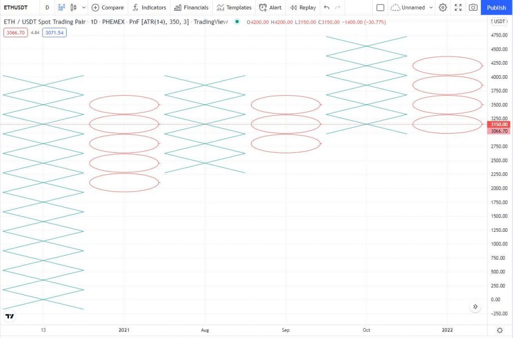 Point and figure chart for the ETH/USDT pair at Phemex.
Once the X upward price movement meets the percentage target, it is contained in one box. These boxes will then form columns that resemble candlestick patterns, except they’re marked in Xs and Os.
Point and figure charts are primarily used to identify trends in the price of Bitcoin. If Xs are stacked in a column, that means that Bitcoin is in a bullish trend. If Os are stacked, that means that Bitcoin is in a bearish trend.
Traders can draw trend lines on top of the columns to predict future price movement. This data can be used to discover resistance lines and price floors over the long term.
Can Point and Figure Charts Predict Bitcoin’s Price?
Point and figure charts are designed for long-term price movements, and they are useful for confirming the current trend. Traditionally, they were used in the stock markets way before computers were invented because they can be drawn on a piece of paper.
P&F charts are best used for long-term positions trading and predicting Bitcoin market cycles. As they don’t account for time frames, they could help traders solidify their beliefs in market bottoms and tops — placing their trades accordingly.
When a trader uses the P&F chart to calculate the market bottom, they could place a strategic market order at that bottom and sell when it hits the top.
There are certain patterns illustrated in P&F trading such as multiple Os for bottoms and multiple Xs for tops, that when expressed over longer periods, can indicate these levels with accuracy.

Who Invented Point and Figure Charting?
Point and figure charting was first written about in the book “The Game of Wall Street and How to Successfully Play It” in 1898. The charting was published in the Wall Street Journal in the early 20th century. It is one of the oldest charting methods in the world.
There was no known figure who first proposed this charting method. What we know for certain is that early bankers and traders on the NYSE used this method to draw out charts for stocks that were trading back then like Standard Oil and the Ford Company.
The earliest P&F charts were drawn with numbers attached. Traders produced more than 50 charts per hour using this method. A trader would draw Xs and Os and attach a number next to them. It was easier to create a large collection of charts using this method because all that was needed was a pencil and a paper.
P&F Chart vs Candlestick: Which Is Better?
Point and figure charts provide an alternative to traditional candlestick and bar charts. They are not inherently superior, but they can provide critical information confirming price breakouts in Bitcoin and altcoins.
Traders can confirm their trade aligns with the green Xs in the new column of the P&F chart. They can later use this information to predict price movement. If a new column starts, it is a good indicator that the price will keep going up or down for weeks at a time.
Point and figure charts can only be used to identify large price movements. Let’s say Bitcoin makes a large 10% price move on the upside. This could start a new column and the trader could go long on Bitcoin when the new column is drawn.
The line of green Xs in the column can keep going as long as the price remains bullish and there isn’t a significant price reversal on the downside which would start a new column.
At the time of writing, Bitcoin is trading at $42,000 and the daily point and figure chart indicates that it has been stuck in a red O column for the past few months.
 The last few months for Bitcoin were bearish.
This corresponds to the last time Bitcoin was on a bullish run for months before a major trend reversal. Bitcoin reached an all-time-high of $69,000 in November of 2021 and has seen bearish divergence since.
If Bitcoin ware to break out of the negative O column, it would have to make large price movements on the upside and that would set off a new column marked with green Xs.
Traders can effectively jump back and forth between the candlestick/bar charts and the P&F charts to confirm their projections before opening a trade.

How To Use Point and Figure Charts?
Point and figure charts are not yet available in the Phemex trading panel. They were recently introduced as a feature on TradingView. They are a premium feature, and a trader has to have an account to switch from the regular candlestick bars to point and figure.
Start by opening the BTC/USDT Phemex pair on TradingView. This will display the current daily chart for Bitcoin in a regular candlestick pattern. Press on the candle icon at the top left of the chart. This will allow you to select the “Point and Figure” option:
 The current Phemex BTC/USDT pair chart at TradingView.
The chart will be automatically adjusted for P&F, and you can view the recent price movements for Bitcoin:
 Point and Figure chart for BTC/USDT.
TradingView allows a trader to adjust the settings on the P&F chart for volatility and reversal percentages. This enables them to shorten the timeframe and see the most recent volatility and trend changes.
To adjust the P&F values, hover over the “PnF” button at the top left, and press “Settings” at the bottom of the prompt:
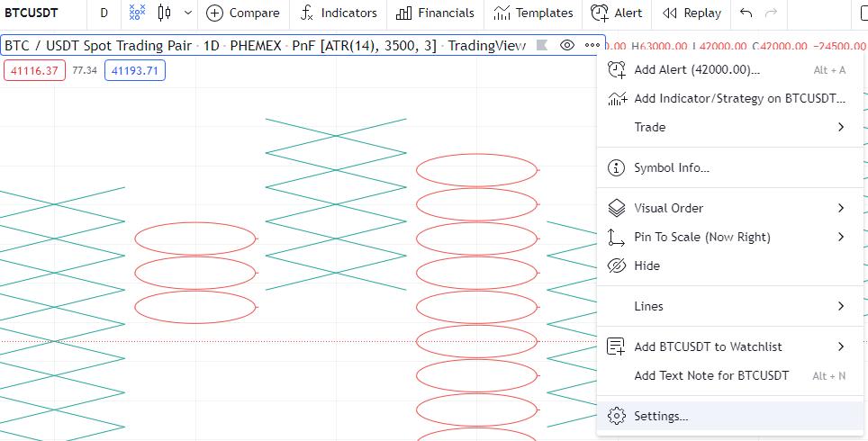
This will automatically load the settings where you can adjust P&F values:

The “ATR length” is set to “14” by default. This is the moving average of the crypto, and if a trader wants to see recent volatility, they can adjust the value to 2–10. If they want to see more long-term volatility for market cycles, they can leave the default 14 or increase it to 20.
The “Reversal Amount” can also be changed according to which a new box will be drawn on the chart every time it meets the criteria.
If we change the ATR length to 5 for shorter-term volatility and the reversal amount to 2, we get a different P&F chart:
P&F Bitcoin chart adjusted using custom settings.
The chart automatically displays the values in which a new box or column will be drawn next to the ATR length. For this example, whenever Bitcoin goes up or down $2500, a new box will be charted.
The last chart marked $2500 price movements for Bitcoin, and if the settings were retained, it would keep mapping new price movements that meet the criteria. If Bitcoin keeps going down, the red O column will keep getting bigger and if the trend reverses a new column will start.
Are There Downsides To Point and Figure Charts?
The main drawback of P&F charts is that they can lag compared to candlestick and bar charts. This makes them practically unusable for swing trading and is only suitable for long-term position trading.
If a trader notices a breakout on Bitcoin when they are using candlestick charts, they can use the P&F chart to confirm the breakout. By the time this is marked on the P&F chart they can miss an ideal entry price.
The price has to move a certain box amount (set by the trader) beyond the breakout point before it’s drawn. This means that unless the trend continues for a longer period, the trader might not benefit from the signal.
Bitcoin breakouts often continue for weeks or months at a time, but a trader could be facing a faux breakout in which the trend reverses as soon as they enter the position. This is one of the dangers of relying on P&F charts exclusively.

Conclusion
Point and figure (P&F) charts are unique because they have been used for 100+ years and are some of the most battle-tested charting options. P&F charts will benefit all traders who want to minimize the risk of entering a position on a false breakout.
If a trader is suspecting a breakout or a price collapse, they can quickly switch to the P&F chart to confirm that Bitcoin is in the adequate X/O boxes. They can also adjust the ATR length and reversal according to their trade style.
The bottom line is that P&F charts are powerful for confirming trends in the price of Bitcoin and altcoins. They’re used to predict large moves and filter out market noise. We recommend using them in conjunction with other TA indicators to get a better perspective for successful trading.
 Register to get $180 Welcome Bonus!


